A Quick Tutorial – Circle Knots

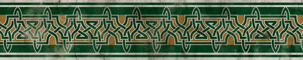
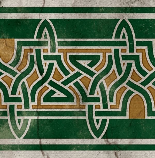
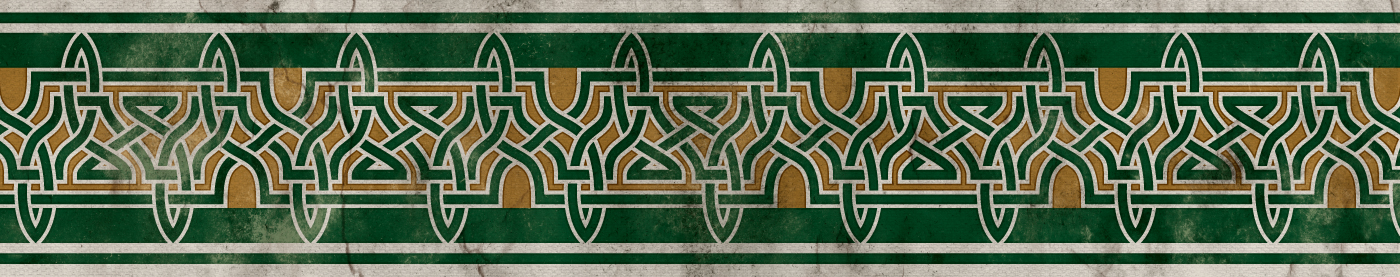
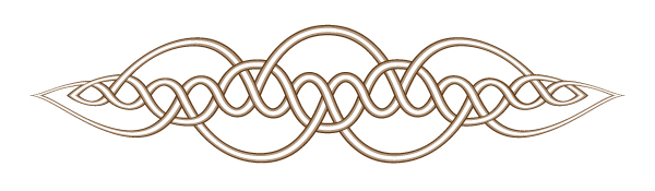
I promised you all a tutorial at some point so here ya go.  Below I’ve got two different methods of building the same knot.  These instruction are for those of your building digitally but you can definitely use these as a jumping off point for draw knots by hand.  Both methods have their pros and cons so do what works best for you.

Break Method
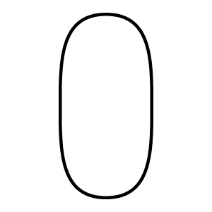
1.) Draw a shape. This is particular one is somewhere between a rectangle with rounded corners and an elongated circle. It’s exact shape isn’t particularly important.
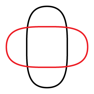
2.) Rotate it. I did 90%. In Illustrator you can hold shift while you rotate it, or just punch in the 90 degrees with the rotate tool or the transform panel.
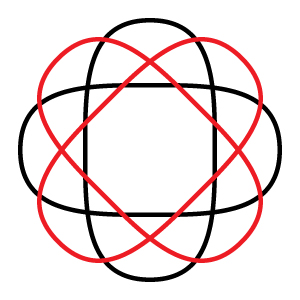
3.) Continue rotating until you have as many copies of your shape as you want. I went with 4. The number of iterations of your shape you want will determine how many times it is rotated.

Number of shapes x 2 / 360 = degree of rotation

4 shapes is a 45 degree rotation. 3 would be 60, 5 would be 36, 2 would be 80, etc…

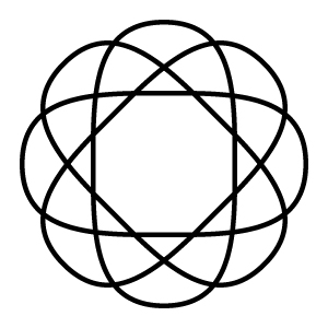
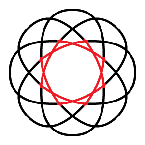
4.) Here is what you end up with. This looks good but is all kinds of wrong because there is no continuity. It’s still 8 different lines. That’s no good. So let’s fix it!
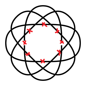
5.) What we’re going to do is “break” each line into two pieces. In Illustrator the cut tool is awesome for this.
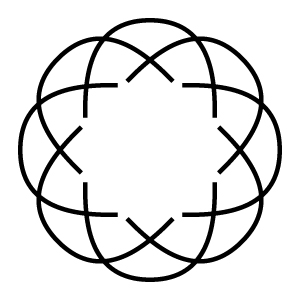
6.) Next we move the end points of our new lines back a bit. Make sure you move each point the exact same distance. In Illustrator I use the arrow keys on the keyboard and count taps. Once you have set of two lines done you can copy, past, and rotate them like we did during steps 2 and 3.
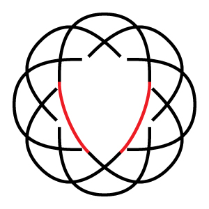
7.) Reconnect the lines. This part may end up involving a little trial and error. For this one I went with a very simple connection without any extra loops.
8.) Repeat until you’ve attached everything together. Once again, copy and paste are your friends. As you work make sure your knot will end up as one continuous line. If it’s not then try again!
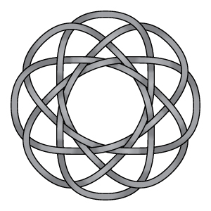
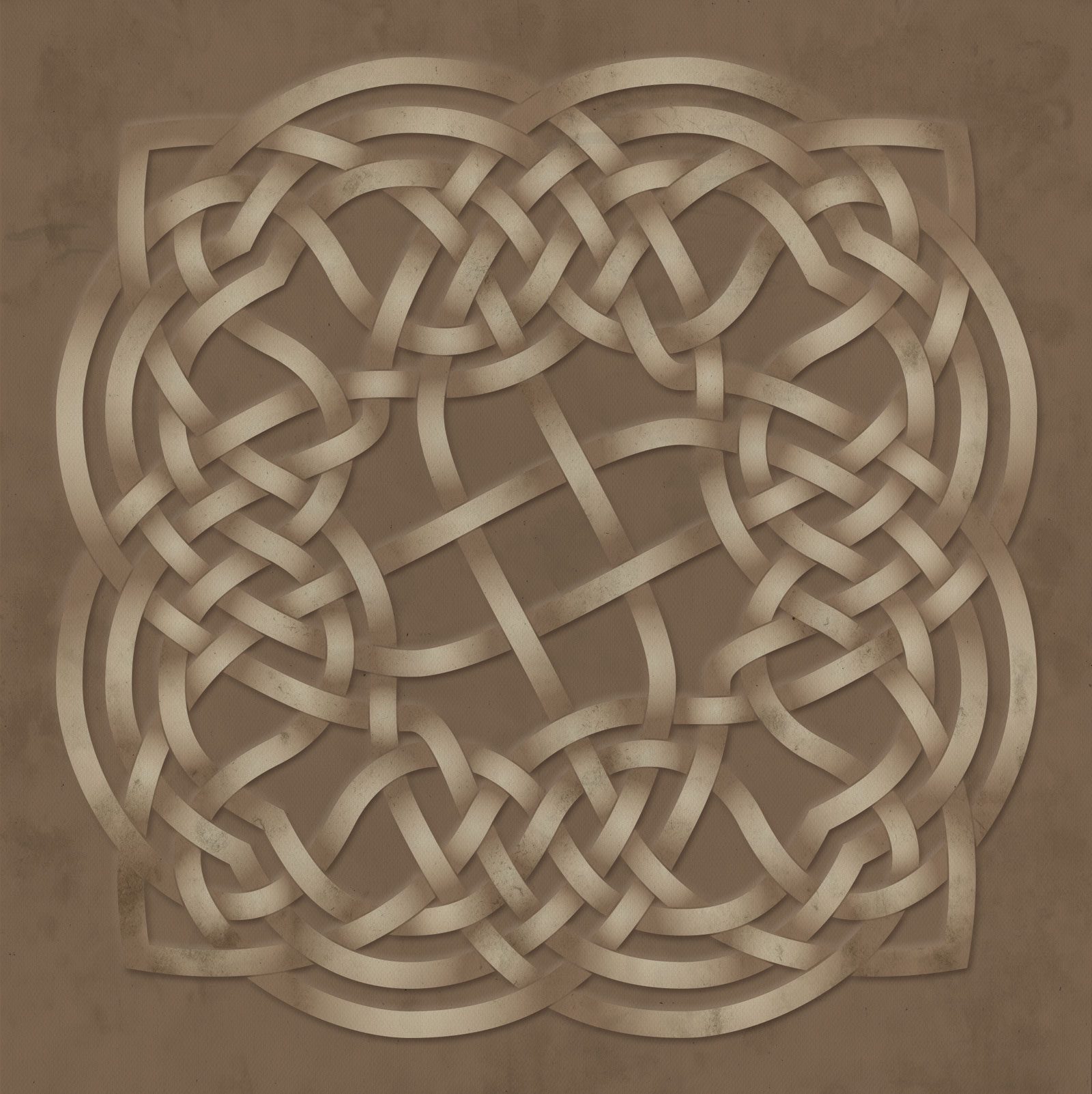
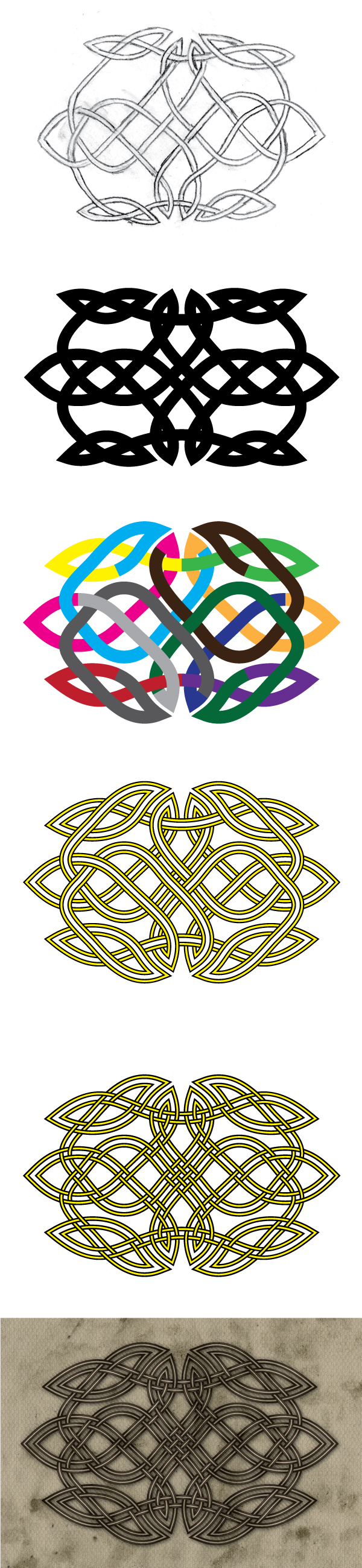
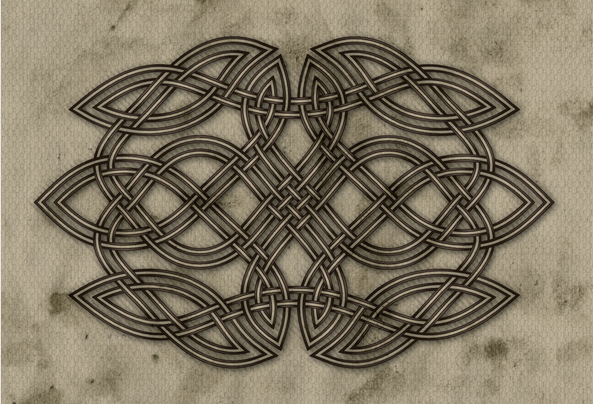
9.) And then of course, draw the rest of the owl. It will come out looking something like this. Not too hard, eh?
Graph Method
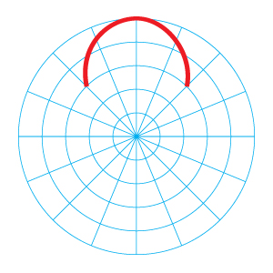
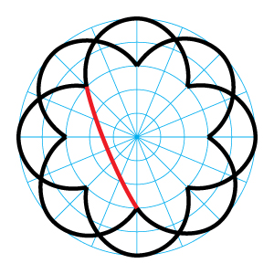
1.) Start with a circular graph. The number of radial dividers will be determined by the number of outside loops that you want. I wanted 8 outside loops so I need at least 8 radial dividers. I doubled it and went with 16 just to have a few extra reference points. Then draw a your first loop. Make sure it’s symmetrical, either by copy and pasting each half or lining up your points perfectly.
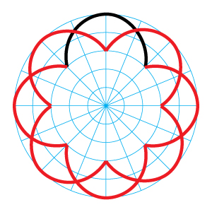
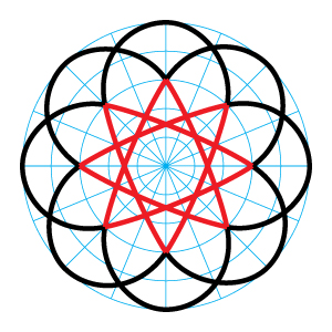
2.) Copy, paste, and rotate.

Number of loops / 360 = degree of rotation

8 loops is a 45 degree rotation. 6 would be 60, 10 would be 36, 4 would be 80, etc…

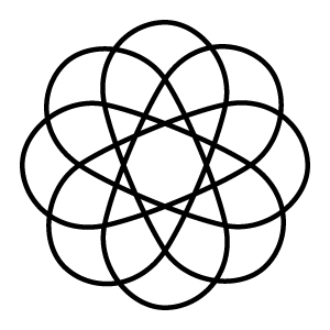
3.) Connect the lines! We’ve basically skipped to step 7 from the break method at this point. It’s the same simple connection line as the knot above.
4.) Copy, paste, and rotate. This time with the inside lines.
5.) Align your points. This part is super super important when you use the graph. When using the graph method this is a very good chance all of you line ends won’t meet up perfectly which will cause you all kinds of headaches while finishing your knot. In illustrator the easiest way to fix this is go into outline view and zoom all the way in. Using the direct select tool, grab all the points that should align and then use the align panel to put them all where they should be.
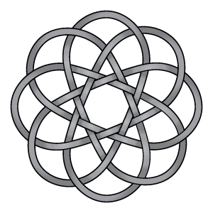
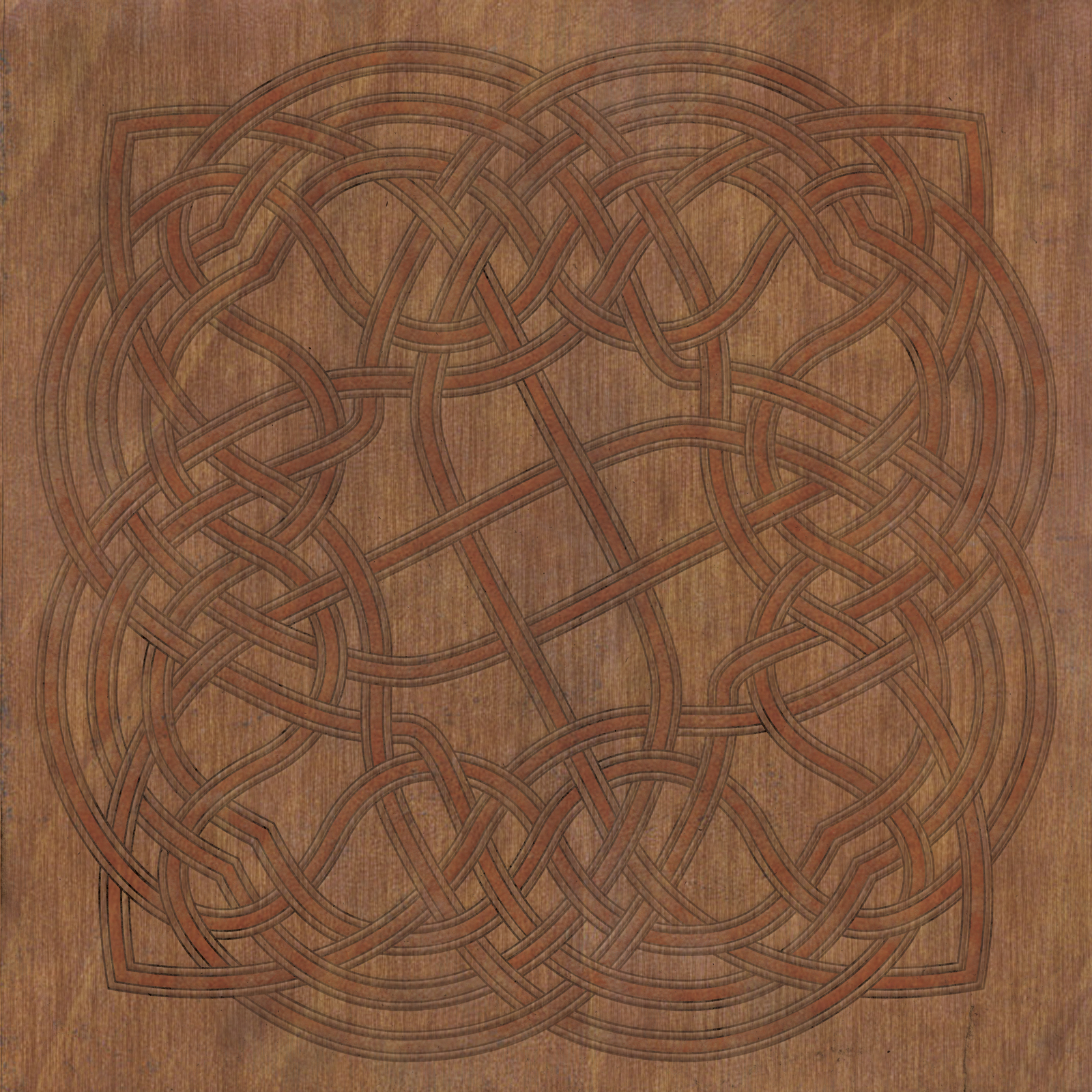
6.) Draw the rest of the owl. Because points tend to stray ever so slightly while working on a graph this method is ever so slightly less precise. However,it’s usually a lot cleaner when doing more complicated knots.

So there ya go. Two ways of doing the same thing. The end knot does look ever so slightly different but that doesn’t actually have anything to do with method. It’s just how things worked out with the angles of the lines I drew. As always, don’t hesitate to ask any questions you may have about this in the comments or by contacting me directly and also, please don’t misuse my art. Thanks for reading!

If at first you don’t succeed….

I know it wasn’t bad but I just wasn’t thrilled about my last post so I had to try something different.  Same knot, new texture.  I’m happier with this one.  Click for a big one.

celtic44d

Maybe it’s wood?

More texturing experiments.  This one might be a wee bit too subtle.  I don’t know.  Oh well.  What’s done is done.  As always, click it for a the big one.  I really should start making a few of these desktop size and proportion so someone can actually use them, huh?
celtic44b

Just a Little Ornament

I’m continuing to learn new things about texturing in Photoshop so forgive me while I work out the kinks.  There’s one that’s not quite as overdone.  When I learn new things my immediate response is to want to do everything thing at once!  Apply all the filters!  At least I haven’t thrown a lens flair on anything… yet.  Anyway, here’ a quickly little ornament that threw together so I could play with it. Click it for a big version. Don’t misuse my art. Yadda yadda…

celtic43b


I’m still working on a decent way to give the effect of paint chipping or wearing off of an aged manuscript.  This one just looks like it’s been cultivating a little green mold.

A Square!

To act as a counterpoint to my last post, here’s a bunch of loopy lines inside a square.  Bonus little square in the middle.  This one was textured in Photoshop instead of Illustrator because I felt like it.  It’s not something I’ve done before but I like I like how it came out so I just may do it again.  Click it for a big one.  And as always, please don’t misuse my art.  Thanks!

celtic42b

A little something

I will eventually finish the big project I’m working on and post it but for now here’s another “doodle”.  I wanted to try to see how many hard angles I could fit into a circle.  I think it turned out okay.  I suppose I could also get some more textures overlays.  I’m getting a little stagnant in my weathering style.

Click it for a big one.

celtic41-1


A quick signature

Had a few spare minutes at work so I wrote my  name.


It says “Dave”.  The majority of the heavy lifting on this particular doodle was done with the art brushes.  They make life easy and fun!

Maybe one day I’ll get around to coloring it… but probably not.

Digital process

I really will eventually get around to doing a knot tutorial.  Promise.  But in the mean time here’s something else.  Here’s how a knot goes from being a doodle in the margins of a paper at my desk I drew while waiting for large files to save to looking half decent.


The process

See, pretty easy, eh?

I’ll break it down a little so you can follow the process a little better.

1.) Draw a knot.  Make sure it’s a continuous line with all the proper under and overs and all that.  Don’t screw up this part or the rest is a waste of everyone’s time.

2.) Digitize it!  There’s a few ways to do this.  You can scan and trace it or, and this is what I did for this one, just recreate it in your vector art program.  I keep the grid visible on the screen and have points snap to the grid to keep all my lines precise.  I also use a lot of small lines that meet but don’t connect.  That will be important for later.  Also lets me copy and paste sections to keep everything nice and uniform.

3.) Couple things happened here.  The first is that I altered the lines to make the knot a little more appealing.  Mostly I adjusted a few things to get rid of the excessive amounts of internal space this knot had.  The second thing is the color coding.  I do this a for a few reason.  The first is to make sure no line section overlaps itself.  When we convert the lines into shapes if there is any overlap it throws wrenches into things.  I also do it as a double check for line continuity.  Coloring lines as I work my way around makes sure there aren’t any orphaned line segments.

4.) Styling and expanding.  For this particular knot I decided I wanted to do a split line.  So I started stacking strokes.  Each line is now a 10pt black line below an 8pt line below a 5pt black line below a 3pt white line.  This give the appearance of two yellow lines with a black strokes.  Then I expanded the strokes so each line segment is now a big bendy rectangle instead of a fat line.  If that last sentence didn’t make sense to you don’t worry about it.

5.) Cut it up!  There are a few ways to do this.  My favourite is using the Shape Building Tool Adobe gave us in more recent versions of Illustrator.  It moves things along in all sorts of dreamy ways.  If this isn’t an option the next best thing is to do is divide everything into tiny pieces and then reassembling them until it looks like it does in the picture above.  This is the part where you really have make sure you’re watching your unders and overs.  It matters, kids, so don’t let me down.

6.) Draw the rest of the owl!  I did a lot of styling on this one that is nearly unnoticeable at screen resolution.  I’m okay with that.  But coloring and texturing is a personal thing and I wouldn’t dare tell you the right and wrong way to use your crayons.  I decided to go with neutral colors and and aged feel on this one.  Vaguely reminiscent of an old manuscript but the knot is standing out from the page a bit.  You really can’t tell but there’s art brush strokes on all the lines, there’s a cross hatched shadow layer, there is internal aging on the light lines… a lot of little things that you can’t see but I hope make a difference.

Anyway, if you click on this one I’ve included a bigger version for ya’ll to stare at.  As always, be cool about my art and don’t steal it.  Thanks.

Click me!

What It’s For

So continuing the discussion about the Celtic Art Brushes from last time.  The reason I started making the brushes was for myself.  I use them all the time.  They can make something pretty so very quickly.  I realize at this point that the majority of the people looking at this site are here to just see something pretty.  But I wanted to demonstrate what the art brushes in the hands of a designer can do.  Let me show you a little something something.

brush18-2

This was created using a new border brush I made, a few minutes in illustrator to style it a bit and add a few colors and then some texture overlays I had laying about.  The bulk of the design work for this was done by the brush.  The rest only took a few minutes.  A few more minutes in photoshop and I could have made this a repeating pattern.   And bam, you’ve got a printable border tape, wall texture for a video game, or the design motif for the front of your Irish themed romance novel.  Options are endless.

Here’s a detail shot.

brush18-3

And what the heck, if you click on this one you can even have it high rez without a watermark.  Please don’t misuse it please.

brush18

Brush Packs and All That

So this is a preview of what I will call for the time being a Premium Celtic Brush Pack.  Here’s how it works.   In Adobe Illustrator you draw a line and it’s a beautiful Celtic border knot.  That’s it.  See that bottom pink line?  Yeah, you can just doodle that line with the pen or pencil tool it the brush does all the work.  Or the square or circle tool.  Seriously, any line will do.  Spiral tool?  Done. It has inside and outside corners if you hit a sharp angle and line ends that loop everything around and keep the line continuous.  Pretty cool, huh?  But that’s not all.  All your normal stroke options still work.  It scales properly and changes color like any other line would.   So stuff like this is just a couple of clicks away.

And just to make it a little cooler, this one comes with 7 different styles.  7!   Crazy, huh?  Okay, and for those of you that are already right clicking images to steal them you’ll notice that the file is called brush15.jpg.  That means that I have a stockpile of these.  All different border knots.  I even have one that is a traditional Celtic bird.  Yup, I went there.

So here’s the question.  What would y’all think something like that is worth?  I realize I’m aiming for the extremely niche market of people who love Celtic knots but don’t know how to, or don’t feel like making them themselves.  But this really is a pretty kickin’ tool for folks like fantasy book publishers, Irish dance schools, even carpenters looking for engraving templates.

The products I’m considering offering are

Premium Celtic Brush Pack – Which is what you see above.  5-7 style with all the bells and whistles.Premium Celtic Brush – Which would be any one style from a pack or one of the many designs that I didn’t didn’t do 5-7 styles of.
Value Celtic Brush – These would be a single design and style that is not built to handle corners.  So straight lines and curves only.
Demo Celtic Brush – Same as value but it also doesn’t have ends either.  These will be a free give-away to let people try them out and see how they work.
Celtic Brush Library
– All of it.  Possibly access to all future brushes as well.

So I know commenting on blogs is totally uncool but I’m really looking for some feedback here.  If you don’t want to comment here feel free to drop me an email at dave@celticknotter.com or any of my various contact methods listed on the contact page on the site.

Thanks.